Reflektive
Refreshing a product to encourage self-growth
ABOUT REFLEKTIVE
Reflektive is an HR tech company that built an employee performance tracking platform for HRBPs, Managers, and coworkers- a single place to collect and provide feedback, run 1:1s, and facilitate reviews. Reflektive prioritizes peer to peer feedback to drive performance monitoring, keep users engaged, and better connect coworkers.
My Role
Senior Product Designer
Product thinking, Information architecture, Visual design & Interaction, prototyping & testing
Teammates
Product manager, Product marketing manager
Timeline
Nov 2020 - Jan 2021
OVERVIEW
How feedback works in Reflektive
Employees, teams, and managers are empowered to request and provide feedback that they can reference for their 1:1’s and review cycle to drive a culture of continuous assessment and improvement.
There are 2 core experiences in the feedback product:
CHALLENGE
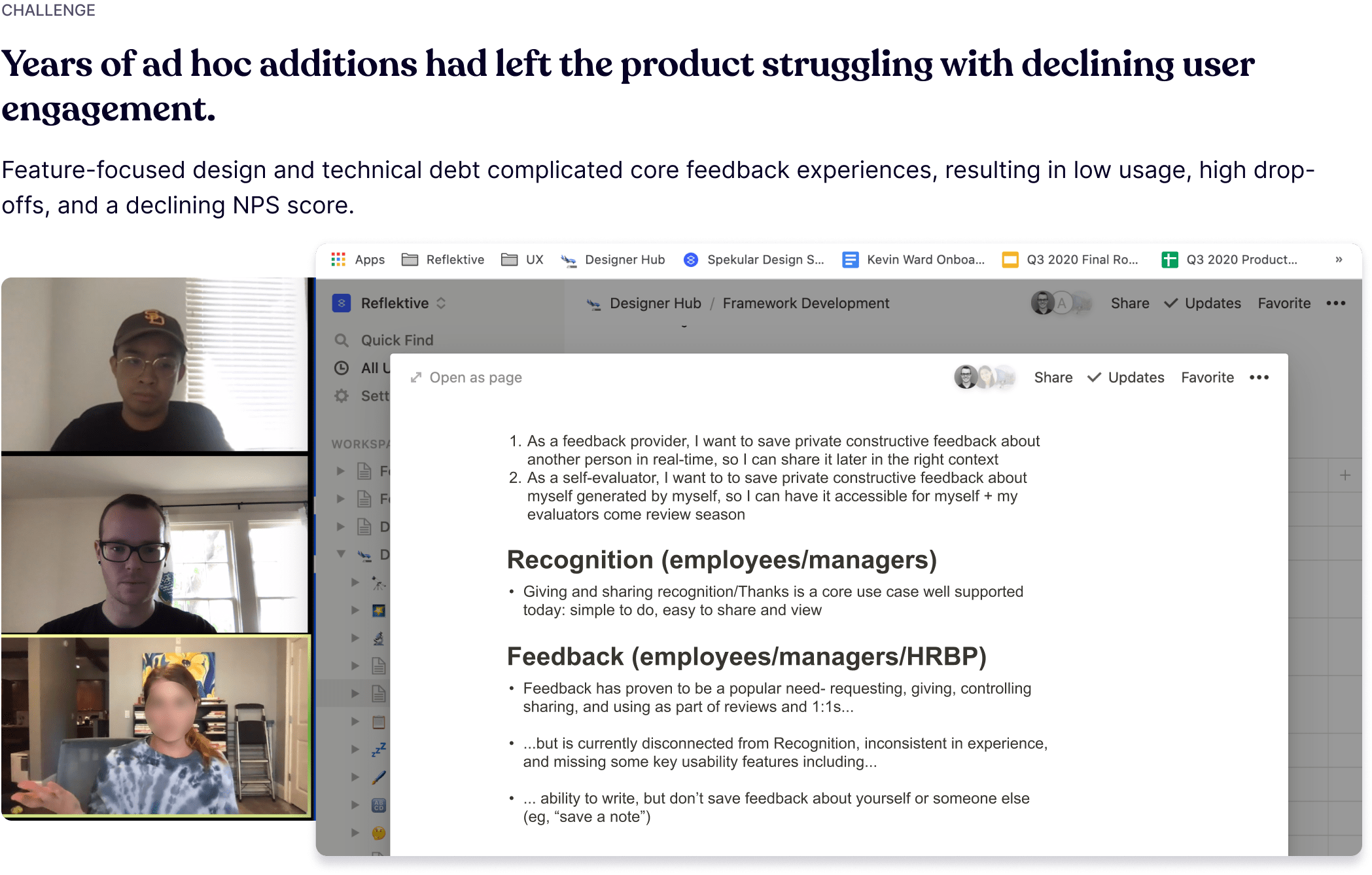
Years of ad hoc additions had left the product struggling with declining user engagement
Feature-focused design and technical debt complicated core feedback experiences, resulting in low usage, high drop-offs, and a declining NPS score.
How might we enhance the product to simplify feedback creation and reference later?
APPROACH
Begin with user-centric goals to direct our improvements
Setting goals for each core experience provided us with a clear guiding light as we assessed issues, opportunities, jobs to be done, and desired outcomes.
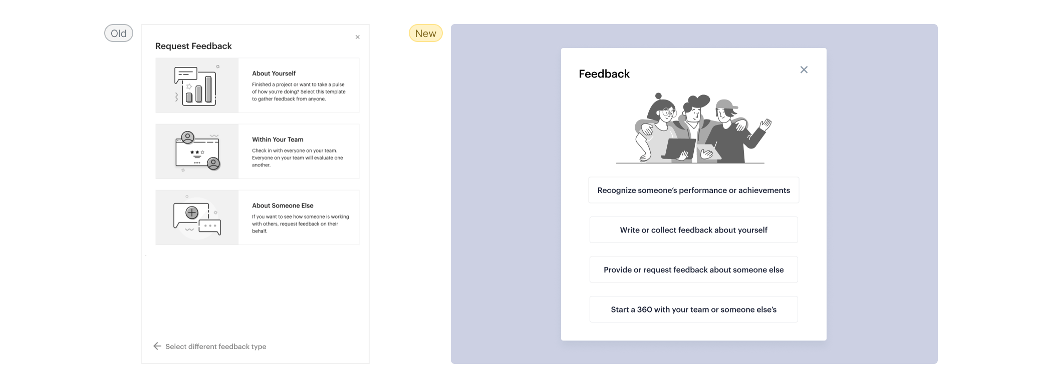
Fixing the entry point discoverability issues and improving the seamless integration
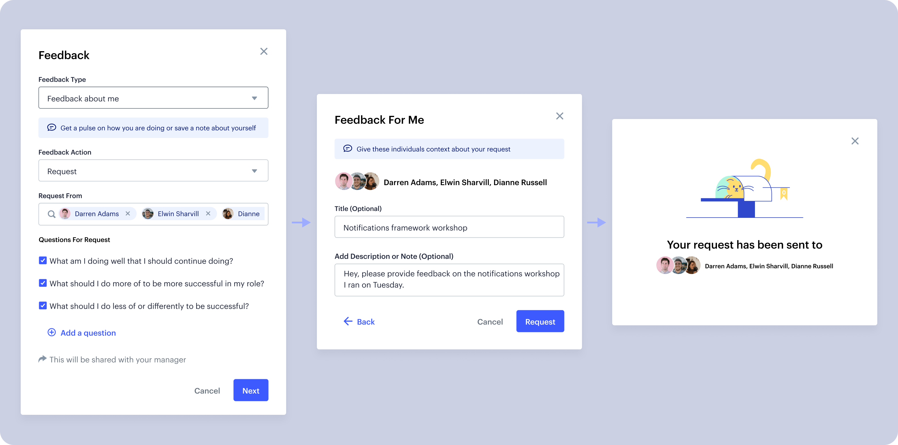
Simplifying the feedback initiation form to a singular, universal call to action and one form pattern would not only make the user experience more intuitive but also significantly lighten the cognitive load. This approach not only enhances user engagement but also minimizes the technical burden by reducing the number of components that need support.
I opted for a modal component to host the feedback form, a versatile UI that seamlessly adapts to any interface without disrupting the layout.
Simplifying feedback forms and fixing feedback visibility comprehension
Analyzing form input data, we identified the essential fields for streamlining. I employed strategic tip placements, clear visibility cues, and instructional placeholder text to enhance user clarity and ease.
Defining a unified feedback object format
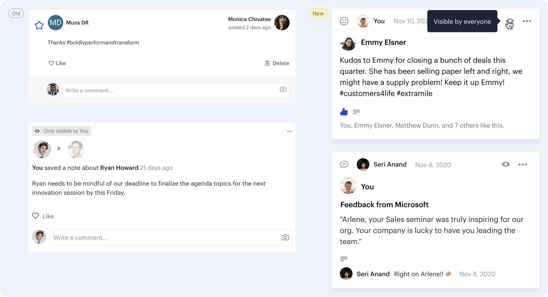
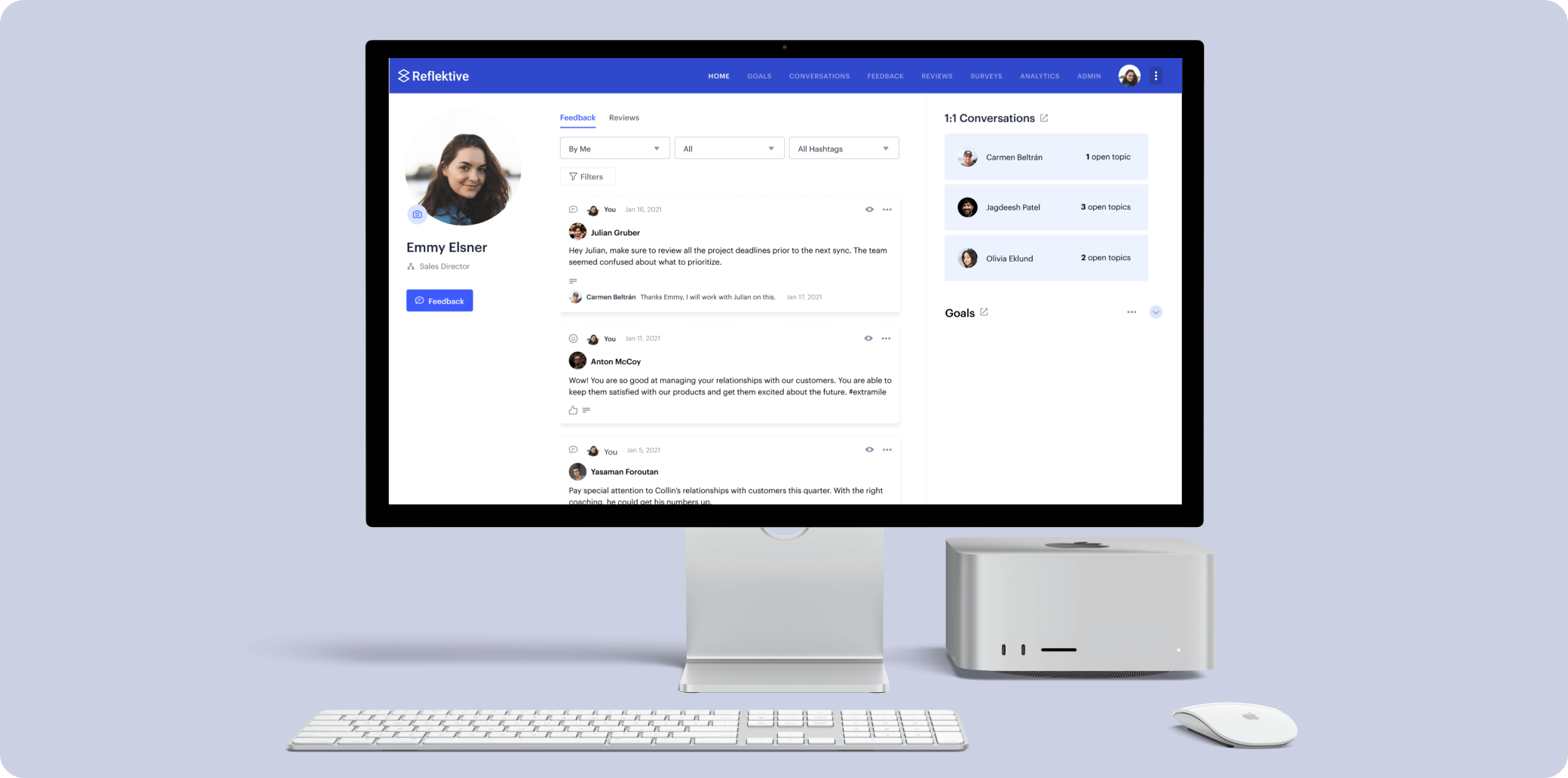
I employed a card pattern, reminiscent of familiar social media posts, for a more user-friendly and adaptable feedback object format.
Each feedback object contains 4 parts: the feedback recipient, the feedback content, additional details for recipient, and actions on the feedback (like, comment). Analyzing form input data, we identified the essential fields for streamlining. I employed strategic tip placements, clear visibility cues, and instructional placeholder text to enhance user clarity and ease.
Filters: the search alternative
Users previously struggled to locate specific feedback for their reviews, relying solely on scrolling their profiles. Initially we wanted to introduce a keyword searching feature, however we didn‘t have the technical resources. To empower users, we introduced key dropdowns for recipient, feedback type, and hashtags, alongside time and provider filters, enabling effortless feedback discovery.
Testing the new patterns with customers
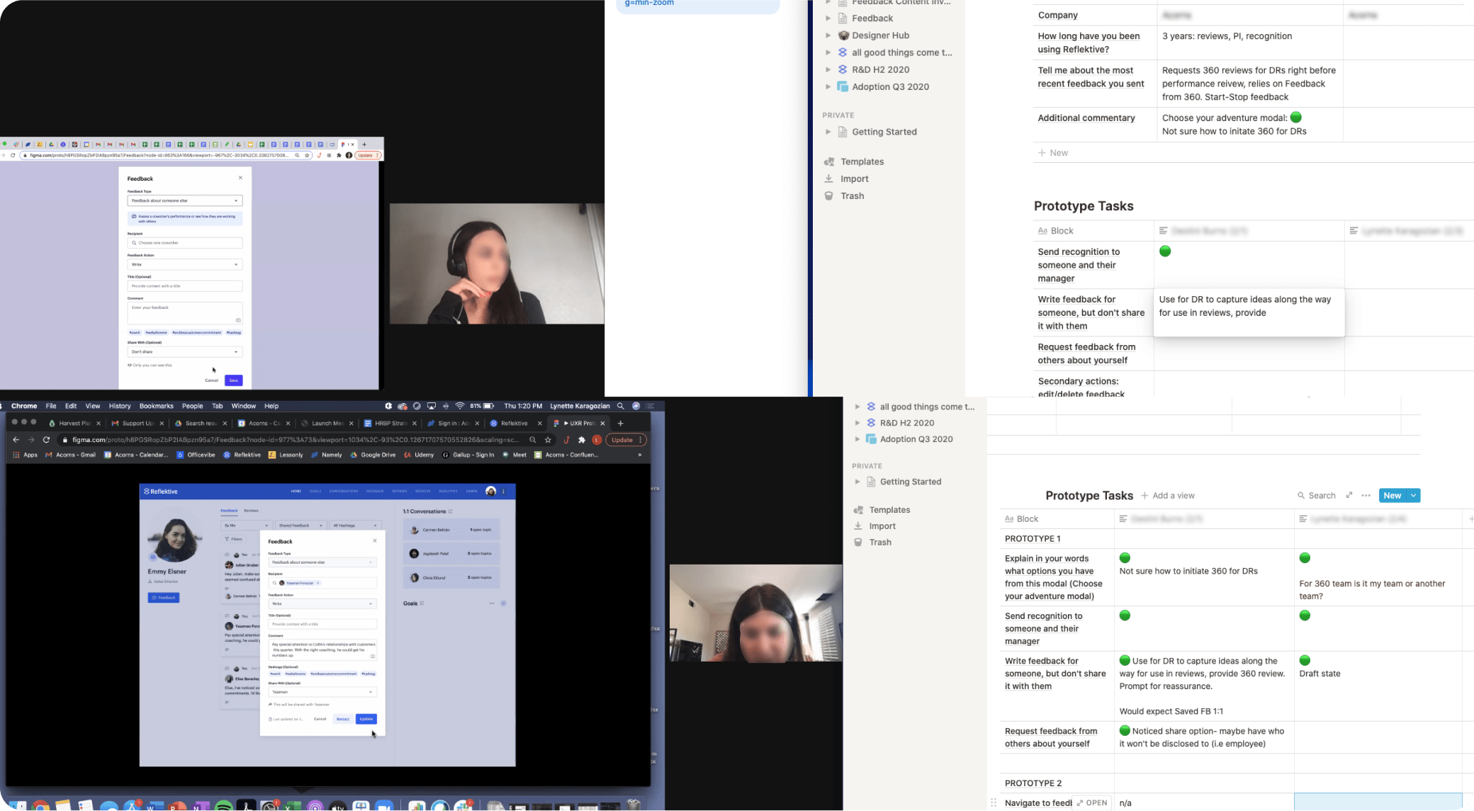
From the pattern wireframes, I created a high fidelity prototype and moderation guide to see how customers interpreted the changes to the feedback tool.
After distilling the insights from these sessions, we further enhanced the product by:
• Switching to more unique icons for feedback type posts
• Introducing timestamps to saved and revisited feedback submissions
• Adding content tips to improve feedback submission (i.e. “helpful feedback is actionable. Make sure the recipients know how to move forward.”
OUTCOME
Final designs
The new feedback system was rolled out to a group of beta customers for further stress testing and to start to collect data around engagement. It was also used as a selling feature for customer subscription renewals.
Results
Increase in feedback object creation
Average time reduction in feedback flow
Increase in feedback initiations
More case studies


