PayPal
Crafting a seamless donation app experience
ABOUT PAYPAL
PayPal is a trusted online payment platform enabling electronic transactions, secure money transfers, online purchases, and digital financial management for individuals and businesses.
My Role
Senior Product Designer
UX research, information architecture, visual design & interaction, prototyping & testing
Teammates
Product manager, Content designer
Timeline
Jan - Jun 2018
OVERVIEW
Adding a donation feature to the PayPal app
When the PayPal mobile teams began planning a consumer app overhaul, an opportunity to opened up to add an in-app donation feature. This feature brought awareness to the PayPal Giving Fund, PayPal‘s suite of donation tools, and appealed to charities considering joining the PPGF.
CHALLENGE
It will need to seamlessly integrate with the overall app
The primary app tasks include checking your balance and account activity, sending money, and paying off a credit bill. How might a donate feature fit in with these tasks? And why would someone use an app to donate instead of a charity‘s website?
What should a donation experience in a financial app look like?
APPROACH
Getting into research
Creating PayPal‘s first native donation experience meant that we had the opportunity to improve upon the current mobile web flow. To do this, I had to uncover the needs and pain points of mobile donors.
What participants said
I recruited individuals who had made a digital donation in the last six months for the in-depth interviews. In each session, I asked the participant to walk me through their last donation experience and tell me about what their ideal donation app could do.
Organizing the insights
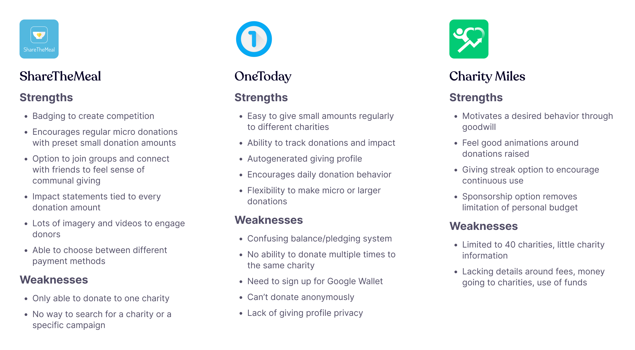
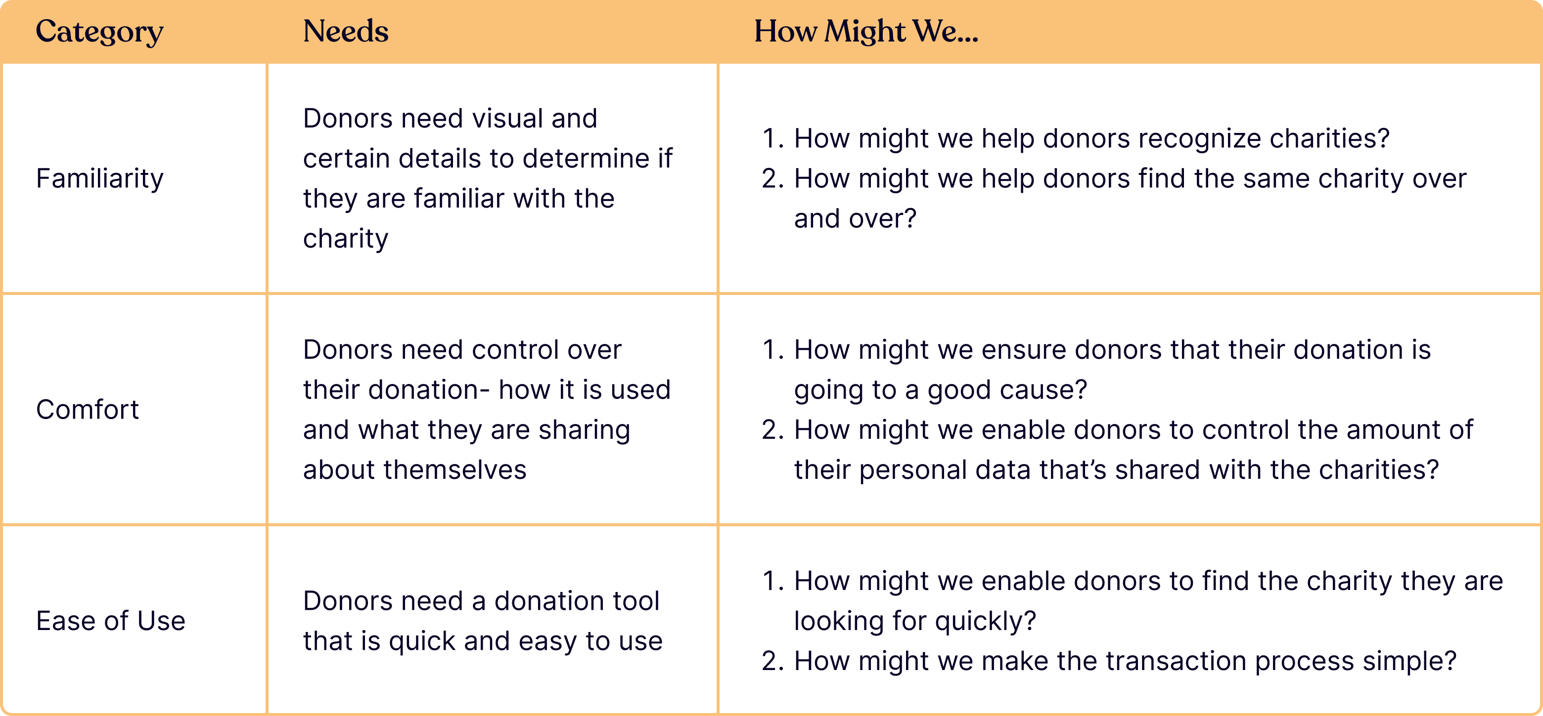
After conducting the interviews, comparing competitive products, and reviewing industry insights, I compiled the findings into these themes:
Identifying and prioritizing features
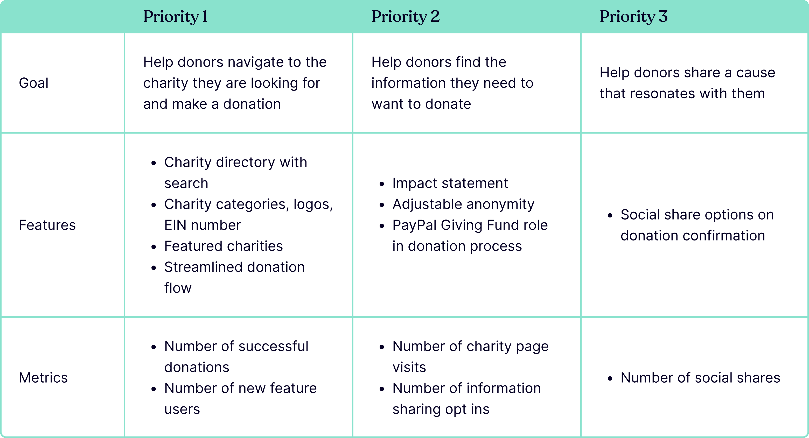
Confident with the research findings, we needed to identify and prioritize what features would make it into the MVP of native PayPal Donate. My product manager and I took a deeper dive into the insights derived from the research.
Building wireframes
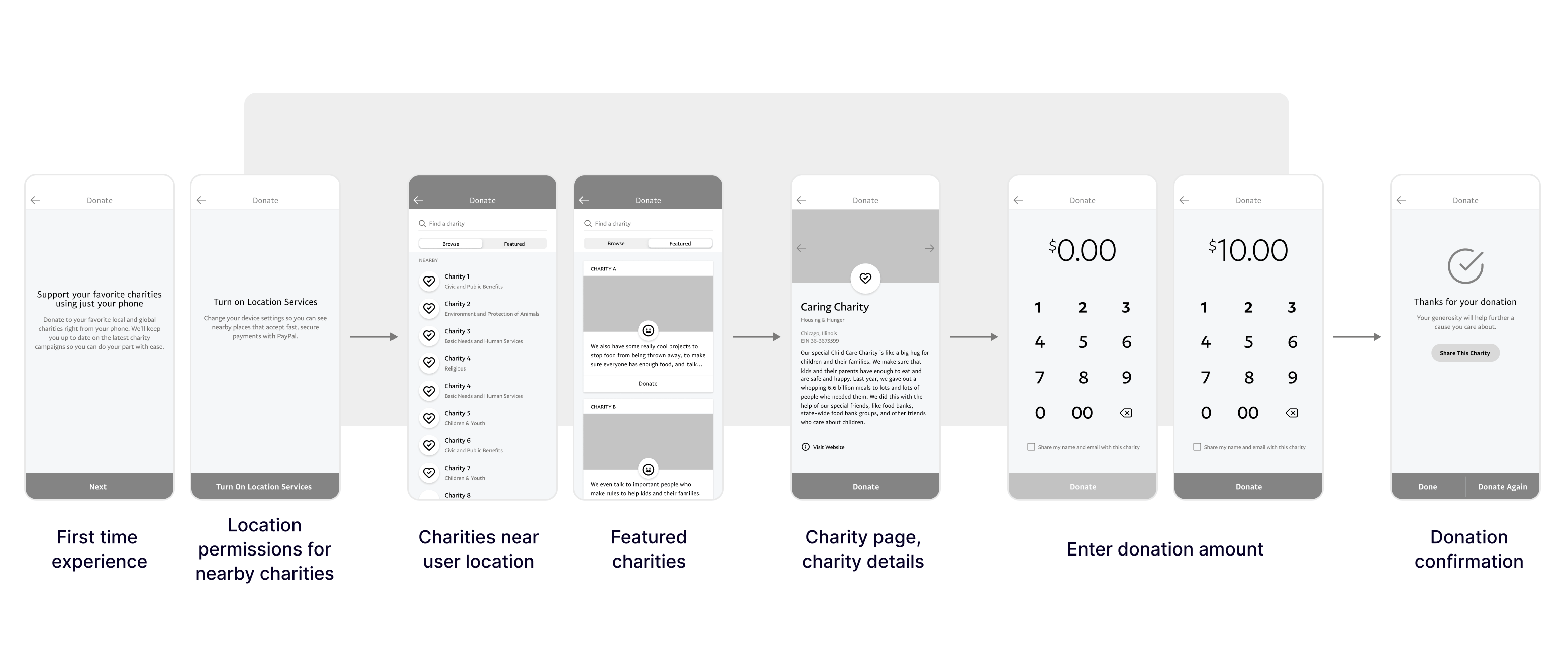
With our personas and features established, I created an information architecture and screen wireframes, leveraging components from the current app design for consistency. Once approved by the Product and Engineering teams, we began to conduct usability tests with the low fidelity mockups.
OUTCOME
Final designs
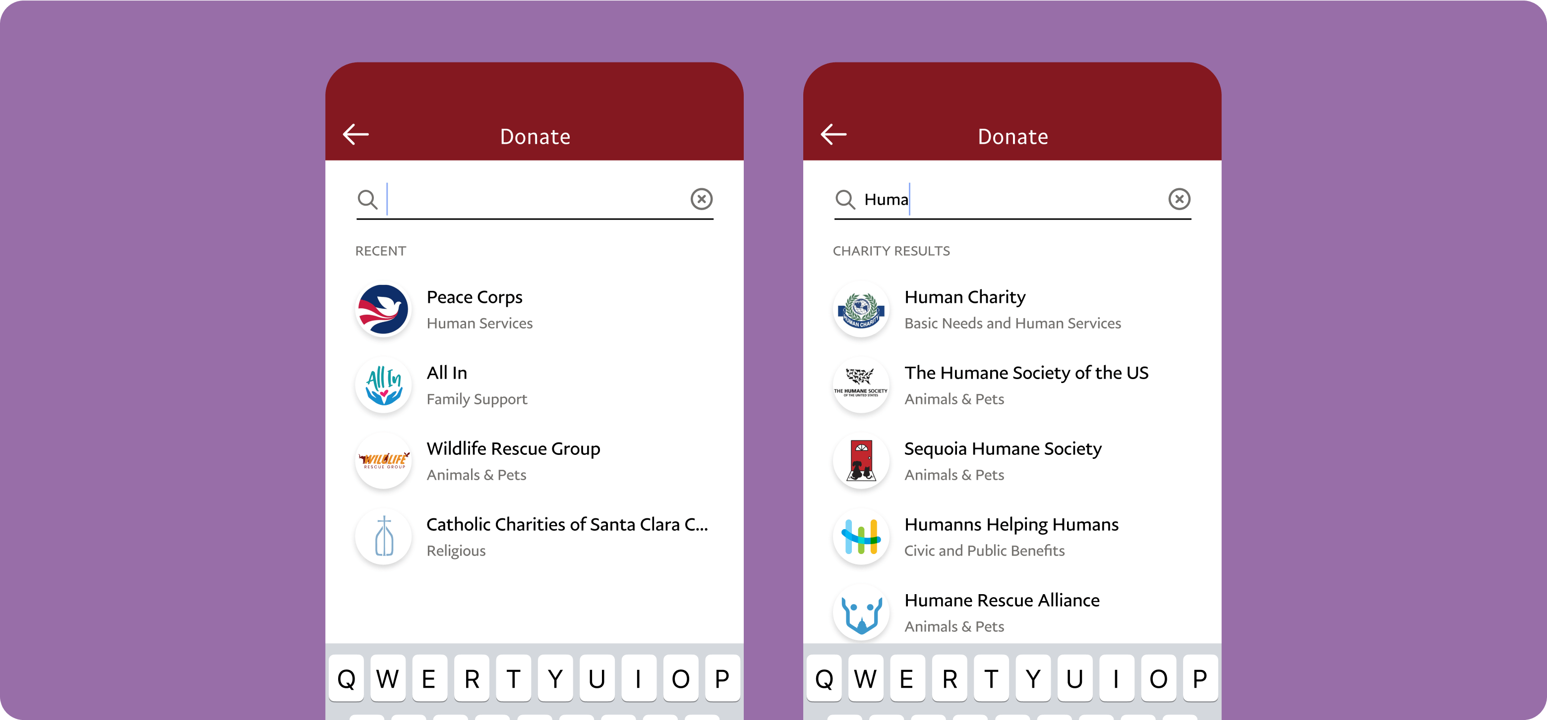
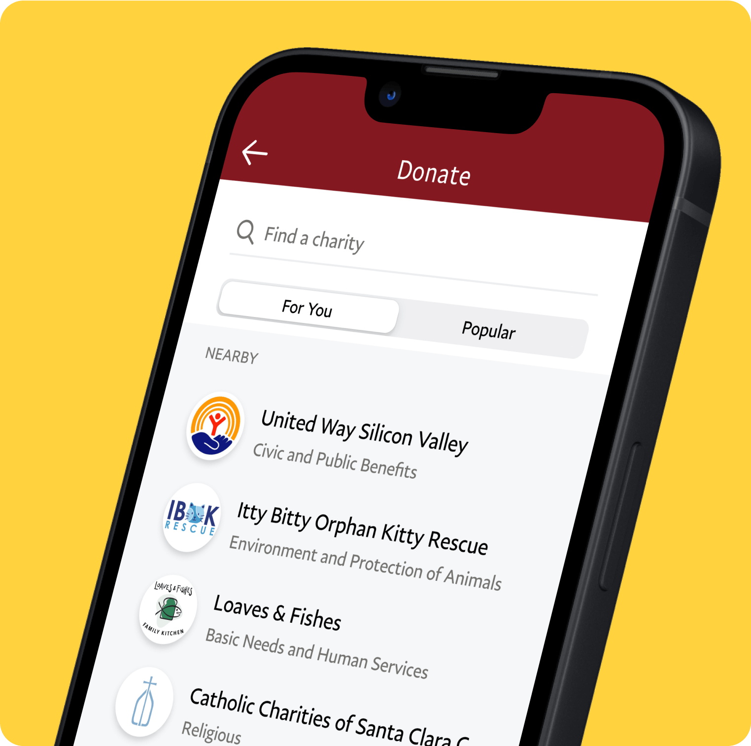
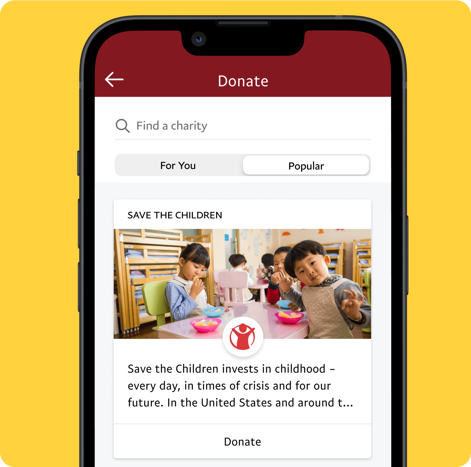
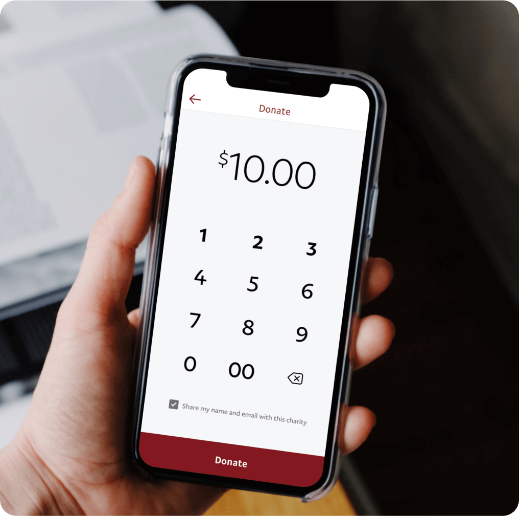
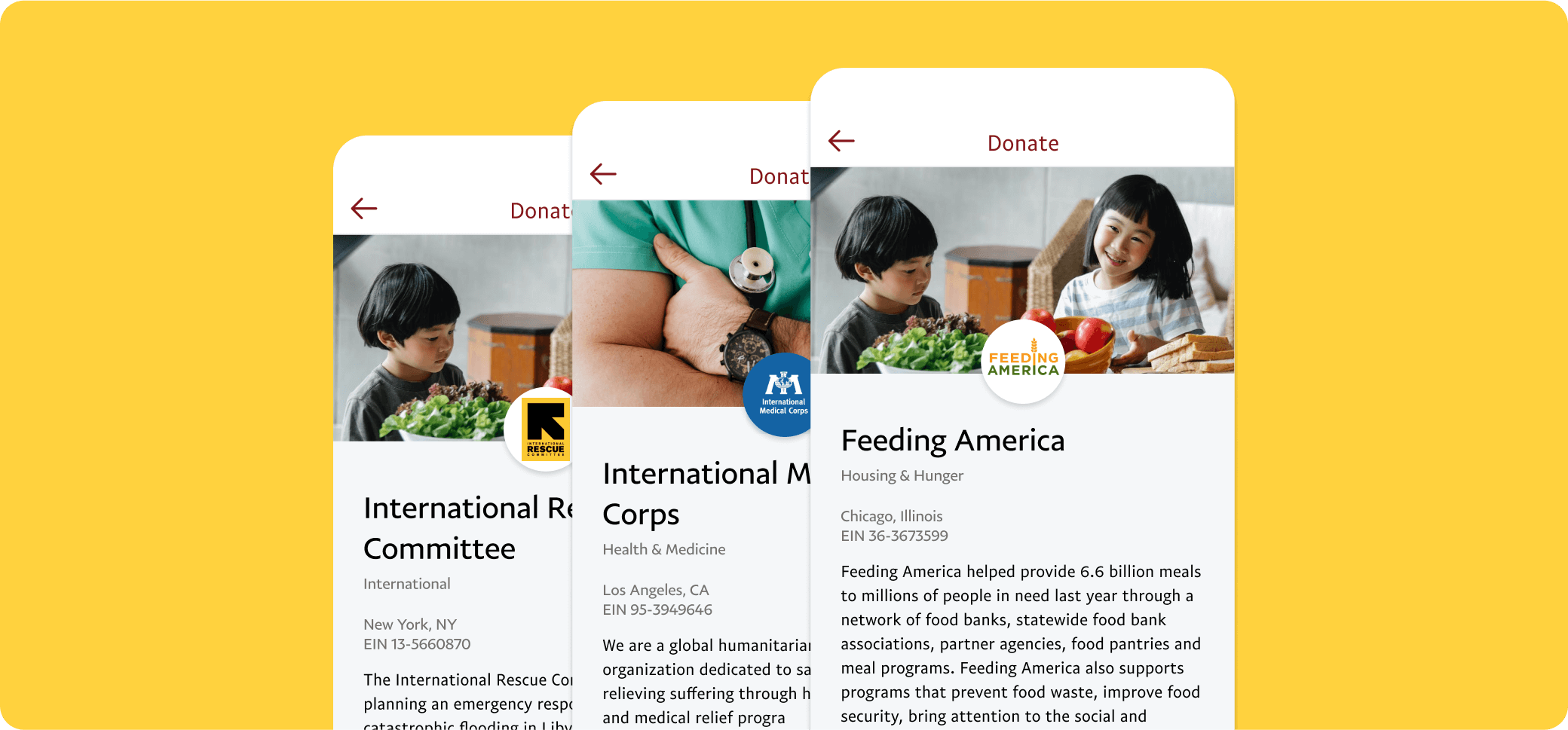
We released the MVP of the native Donate feature three months after the launch of the PayPal app redesign. The focus of the MVP experience:
• Easy charity discovery
• Funds transparency
• Quick donation flow
Results
TPV (in millions)
Successful donations (in thousands)
We launched the feature and saw slow adoption. We reviewed the analytics on weekly basis to monitor where drop off was occurring and began speculating how to make improvements. As Giving Tuesday drew near, we partnered with the marketing team to bring awareness to donating with the PayPal app. This collaboration paid off greatly, we saw a spike in new donors from Black Friday through the holidays.
It may have taken a couple of months for the Donate feature to take off but when it did, we started to see strong numbers on a monthly basis. By June 2019 (one year after launch), PayPal saw 2 million in total payment volume through the app donate feature.
More case studies


